crypta
An intuitive user sign up flow for an e-commerce bitcoin application.

Name
Crypta
Year
2024
Role
ux designer
Crypta was a solo UX/UI project focused on combining secure functionality with an accessible design. I was tasked with building the visual identity and designing a seamless mobile signup flow for a Bitcoin e-commerce app that integrates with traditional banking systems. The signup process required users to enter 22 pieces of personal information, making usability and accessibility crucial to avoid friction or frustration.
Problem Statement
Crypta needed a secure and accessible mobile onboarding experience that could collect a large amount of personal data without overwhelming the user. The challenge was to break down a complex and sensitive registration process into clear, user-friendly steps while maintaining professionalism, clarity, and brand consistency throughout.
Product Design
UX/UI Design
UX Writing
Design Thinking
Graphic Design
Branding
Product Design UX/UI Design UX Writing Design Thinking Graphic Design Branding
1. understanding the problem

Signing up for a financial service can be daunting, especially when users are asked to provide highly personal information. Through sketches and early user flow planning, I identified two key pain points:
Cognitive load: Asking for too much information at once can lead to drop-offs.
Trust and transparency: A lack of clarity or visual consistency can make users wary of inputting financial details.
My goal was to design an experience that minimized friction, maximized clarity, and guided users through the process step by step all while remaining professional and trust worthy.
Due to time and scope, user research was informal and design-driven. I referenced accessibility guidelines, best practices in fintech onboarding flows, and competitor apps like Wealthsimple and Coinbase to ensure that my design choices were aligned with user expectations.
Key insights included:
Users feel more comfortable with progress indicators when filling out long forms.
Minimalist layouts reduce intimidation and increase completion rates.
Clear escape options like "Need support?" buttons or browser links offer reassurance.
2. User Research

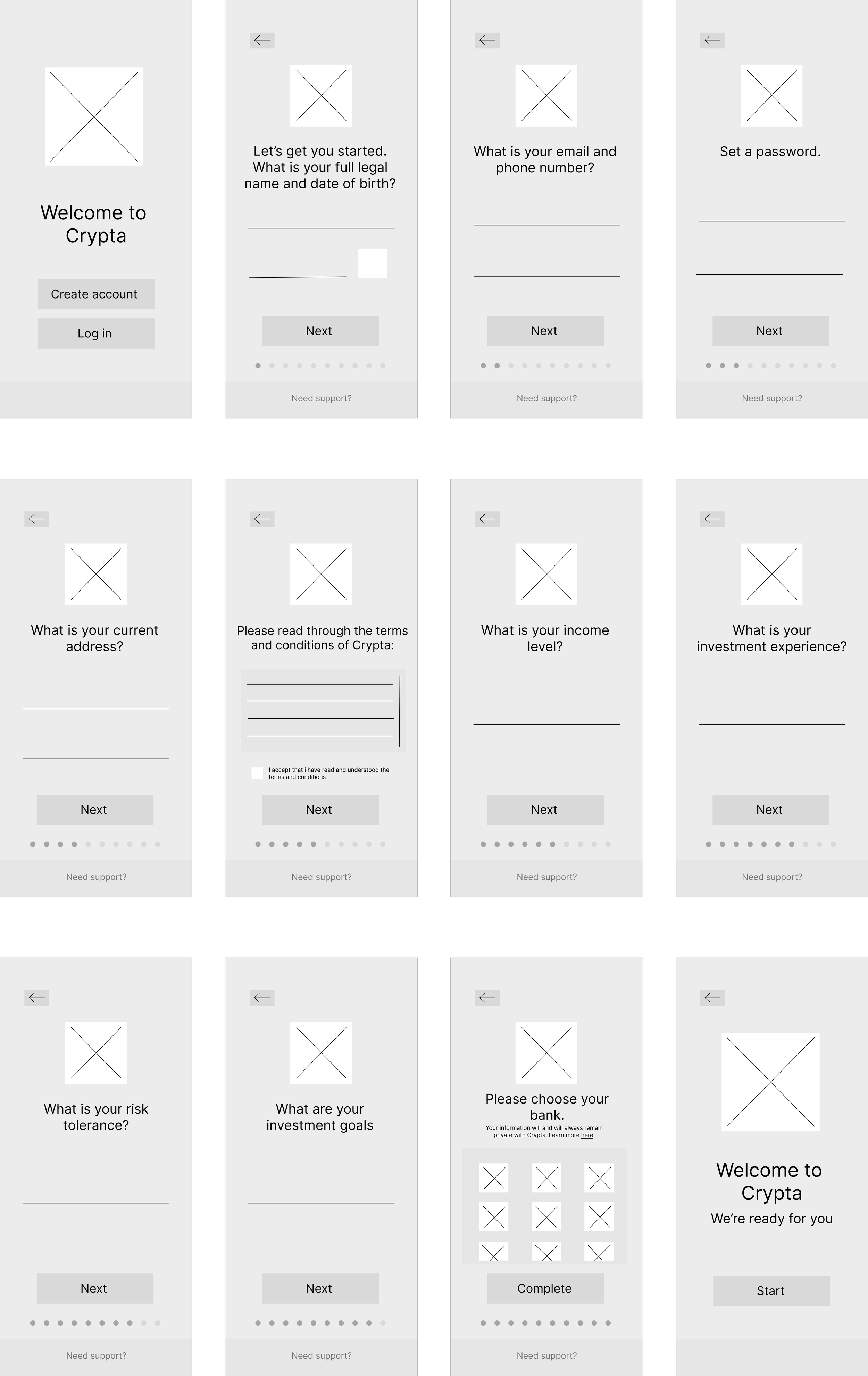
I first began with creating the branding for Crypta. The Crypta logo and colour palette made and chosen in Adobe Illustrator. I aimed for a modern, secure, and professional look that communicates trust. Looking at competitors helped me understand what colours work with the environment of money and banking. I then moved on to making sketches where I mapped the entire user flow on paper to understand each interaction point. This helped when I moved onto Wireframes. They were built in Figma with accessibility in mind, I prioritized one form field per page to avoid cognitive overload while keeping layout and spacing simple. Once I felt confident with this I moved onto the High-Fidelity Prototype. Using Crypta's brand elements, I constructed 22 individual screens for the signup process, keeping layout, button styles, and iconography consistent.
UX Enhancements:
A progress bar along the bottom of each screen
Option to contact support or open the help center in-browser
Clear field labels and input instructions
3. Design Process

-
The journey between the wire-frames and the high-fidelity prototype was very straight forward. I found that I was accurate with the amount of screens needed for the step-by-step sign up.
4. Solution and review
The final prototype was a clean, intuitive, and accessible mobile signup experience that guided users through 22 data entry points without overwhelm. Key outcomes included:
A highly structured layout with one task per screen.
Accessible colour contrast and large, readable fonts.
Visual progress tracking to reduce uncertainty.
Built-in support options to prevent user frustration.
Next Steps could include user testing to validate flow efficiency and trust perception, refining micro-interactions for error states, and expanding the prototype into the app’s dashboard and transaction areas.