Mera
Short for e.phem.er.a
/əˈfem(ə)rə/
noun
plural noun: ephemera; noun: ephemerum
"Things that exist or are used or enjoyed for only a short time."

Name
Mera
Year
2024
role
ux designer
As somebody who actively engages with local events in Calgary, I found it hard to find information about all local events from one dedicated source. While there are some Instagram pages and websites that post what’s new in the community, none seem to offer a seamless and straight forward experience. This gap is what sparked the idea of Mera – an idea of potentially putting all local events of Calgary into one app.
Within the Interactive Design Diploma, my Design Studio I class tasked us to find a real-world problems and to then pitch the ideas of our solutions to each other. After presenting the idea of Mera, I gathered a group together that also were interested in pursuing my idea and it took off from there.
Our Problem Statement
Residents of Calgary want to experience a variety of local pop up events, but information is lost across various platforms, making this difficult. At the same time, small businesses want to increase brand awareness and sales, however are limited in reaching their target audience. Therefore, community engagement and local economic opportunities are often missed.
Product Design
UX/UI Design
User Research
Group Work
UX Writing
Design Thinking
Product Design UX/UI Design User Research Group Work UX Writing Design Thinking
1. understanding the problem
This problem addresses two different user groups: the citizens of Calgary that want to attend local events; and local business owners that want to market their events. Therefore, we knew that our platform that we were designing needed to be versatile to service both event-goers version and can easily swap over to vendor-focused for businesses. Before we could best understand what both users needed and what Mera could look like for them, we needed to conduct research with those that attend local events and local businesses.
2. User Research
We created two surveys: one for the user and the other for the vendors. The survey had questions that were closed, open-ended and multiple choice to allow us to collect qualitative and quantitative data. We then shared the online surveys through social media, printed posters, as well as reaching out to small businesses around Calgary.

The pie charts show the results from two questions based on whether our respondents attend local events, vs how much of these respondents end up missing these events. The result from these pie charts has helped our team realize that there is a large gap between the 97% of users that attend local events and 91% of these users then often miss local events.
(“What would make it easier for you to find local events?”)
“A centralized area to see what’s going on at a given time. Preferably with a map view so you could see how far it was from your house and see what travel options are available.”
“If there was maybe an application or website that held most, if not all of the local events occurring in a list.”
“If there was a reliable and consistent platform that provided the needed information for these events”
Then we have some of the results from our final question in hopes to connect the gap between attending vs missing events.
From even just these highlighted responses, it gives an understanding that there is a need for a platform that can deliver information about local events in one place and be easily accessible. From small businesses, we received a handful of responses who say they occasionally host and do not get as much attendance as they would like because of how detached some of the marketing can be through social media.
Therefore, with these responses we felt were able to move forward with possible designs to the application of Mera.
3. Design Process
Now that we understood both of our target users needs and pain points, we were then able to get started on the design for Mera. We chose to only develop Mera as a mobile application to be more accessible for a prospective user. This could then for example allow users to do quick searches in the moment they are looking for something quick to do and attend within the community. With the use of Figma, we were able to create wireframes which then aided our low and high-fidelity prototypes, refining navigation and interface elements.
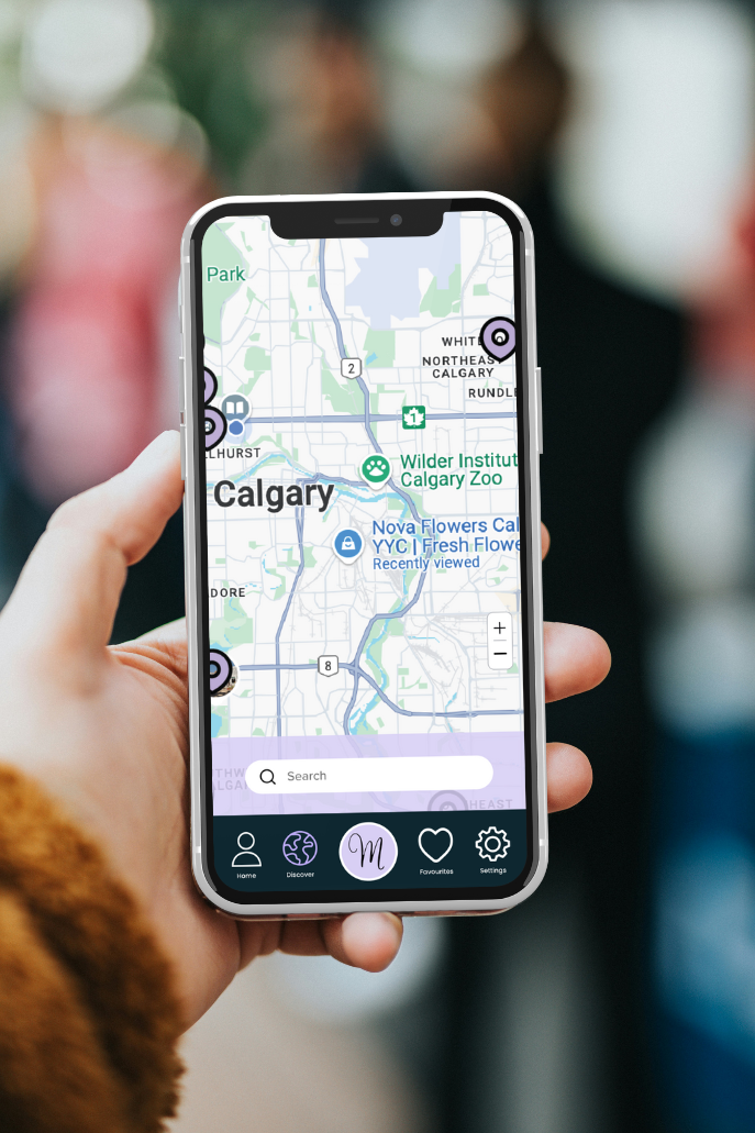
When working on the overall user face, we wanted to match the users side with the event hosting side as close as possible. We did this by choosing five important elements in the navigation for each. Because the navigation was a large focus in the development of Mera, we kept the middle button with Mera’s ‘M’ logo the same for both users. This was the tab to ‘explore events’ or ‘submit event’ depending on which version the user is using. And the profile and settings tabs were kept the same in both versions.
The user side of Mera will feature a personalized event feed showcasing spotlighted events. These will be by businesses that can choose to work with Mera to have their event put forward and advertised for the user. The explore page will have a map of the city with what current events are taking place allowing the user to see what is close by, and there will be a calendar view of confirmed attendance to upcoming events on the profile page. The vendor side will offer a streamlined process for submitting new events, and a chat page for events that make up more than one vendor and a page for recent reviews.
Mera is designed to bridge the gap between not knowing about what local events are taking place and signing up to them. Although the application is more for exploring and discovering, as well as submitting events, when it comes for the user to sign up for them Mera will take the user to whichever third party the vendor chooses to host and sell tickets on.


-
The journey between the wire-frames and the high-fidelity prototype was not complicated as we began with a great understanding of what Mera could look like through sketches and user flows. The main difference that had evolved was the page with the heart icon labeled ‘Favourites’ because we later introduced the idea of vendors having the ability to showcase their events.
4. Solution and review
The main piece of feedback that we received was how to switch between the version of the user and the version of the vendor. If could work on this project for more than the four months we had, we would have included an option within the design to switch between the two within our settings page. We also would have gone through and done some usability testing through the prototype. Regardless, the team and our instructors were impressed with our final project.
We finished our high-fidelity prototypes and presented this project to the rest of our Interactive Design Diploma program at SAIT. We really focused on the storytelling of the product, the empathy for our users and the research that went into it. It was met with great responses from other students and faculty members. We received an A+ for the final project and for the class.